How To Create a Landing Page in Squarespace 7.0 to Maximize Engagement
You may already be well on your way into building out your new Squarespace website using one of our Website Template Kits or perhaps you already have a Squarespace website that you’d like to refresh. All while doing so and in preparation for a smooth launch, we highly suggest setting up a landing page that’s custom to your businesses brand identity so your business can run and you can engage (even if your website just isn’t quite ready yet!).
LOOKING FOR HOW TO ADD A COVER PAGE TO SQUARESPACE 7.1? HEAD HERE.
So..what exactly is a landing page?
A landing page is simply a stand-alone web page created specifically for the purpose of presenting information with the ultimate goal of converting visitors into leads. Landing pages are used for a wide variety of purposes from promoting a product or service or simply as a placeholder to engage with website visitors while your website is currently under construction.
In this blog post, we are going to focus on the “How-To’s” of setting up a custom landing page for your website to have up and active while your website is under construction however, these tools can be applied to any form of a landing page you desire!
Before we get started, we want to make note that there are two very different ways to go about creating a landing page for your website, and the route in which you take all depends on how custom, and how much information you are wanting to display on your landing page.
If you want a simple stagnant page that provides website visitors with the very basics about your business and captures leads continue on reading Option 01 – Cover Page 101 below.
On the contrary, if you are looking for a more extensive landing page with that extra WOW factor, with much more content and imagery, a form, call to action or integration into external platforms linked through Zapier, check out Option 02 – Advanced Landing Page 101.
Disclaimer: We suggest option 02 only if you are comfortable with the basics of Squarespace and customizing your own page. Option 02 instructions below are compatible with all of our Coast Kit Templates and BRINE family templates.
Let’s begin!
Option 01 – Cover Page 101
Much like a “Landing Page”, Squarespace Cover Pages are an excellent way to create that “Coming Soon” page for your website while still generating leads, engaging or driving visitors to other links or social platforms in the meantime.
Setting up a Squarespace Cover Page is super simple, in fact, it’s so simple it can be done in less than 10 minutes (Heck yes!)
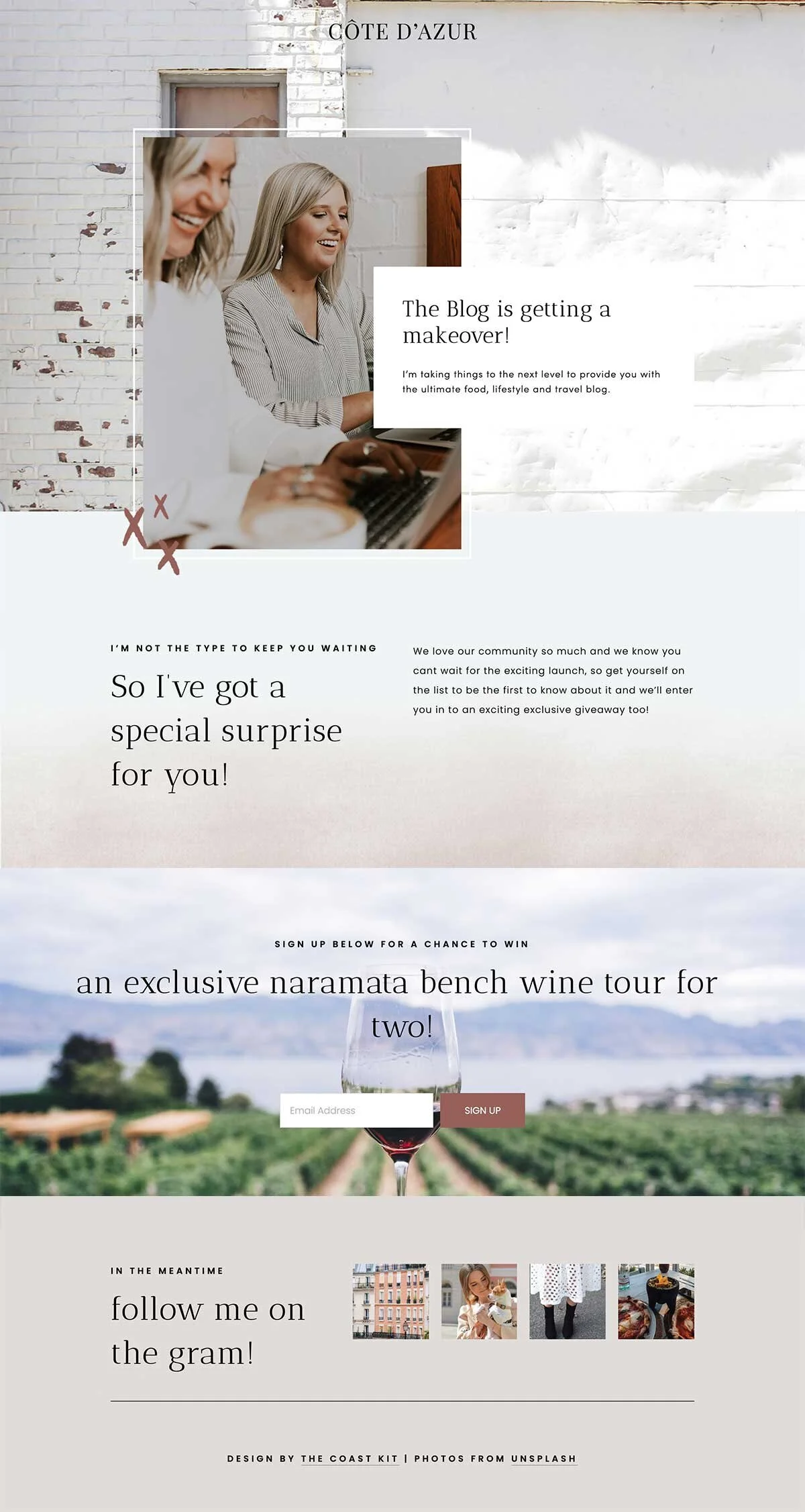
We’re going to walk you through, step-by-step on how to set up a Cover Page for your website, and in this case, we’ll be creating a Cover Page for the Côte D’Azur template.
Let’s get started:
1) Jump into your website from the Squarespace dashboard
2) On the menu on the left hand side, click PAGES, then click on the + icon and select Cover Page. Be sure to name your page!
3) Move the Cover Page down to your Not Linked Section in your Pages Dashboard (This will ensure it doesn’t appear within your website navigation!)
4) Click into your Cover Page & select a layout that suites your style preferences, then click save. In our case, we have chosen the “Card” layout, as we think it fits quite well with our overall style and design of Cote D’Azur.
5) Next, add branding and text into the BRANDING & TEXT tab.
a. For Branding, you can add in your logo by uploading the web ready logo file (.PNG files work best, to ensure a transparent background!) or, feel free to add in a text style logo if you don’t have a logo quite yet. Once you upload your logo, it likely won’t be sized the way you want it to be…don’t worry, we’ll easily adjust that at the very end!
6) Next, jump to the MEDIA tab, and lets add in your background image. Always ensure your image is a large enough file size so it doesn’t appear blurry. We suggest a minimum of 1500 px wide.
PRO-TIP: Want to set a background colour instead of an image for your landing page, or create a custom designed background image like ours below? For the background colour, simply select None for your image upload within the Media tab, then change the background colour within the STYLE tab, which we will visit in Step 9. To create a custom background image you can do this easily in the free CANVA platform, or in Photoshop.
7) Next, we suggest adding in actions under the ACTION tab such as buttons, links or forms. This is a great way to capture leads while your website is in the works.
a. To add a button that links to an external URL, within the ACTION tab, simply ensure the Buttons is toggled to ON within the SELECT ACTION TYPE section. Enter in the text for your button, and right next to it, add in the URL of the website you would like the button to link to. You can also toggle on to NAVIGATION, this would then make your link clickable text, instead of a button.
b. Next, let’s say instead you want to generate a mailing list to generate leads for your business. To do this, you will want to add a Form or Newsletter Signup in the section below SELECT SUBMISSION TYPE. To add a custom Squarespace form, ensure the Form is toggled to ON, then continue on to EDIT FORM. You can determine what information you’d like to collect from the visitor under the BUILD TAB, as well as set how you would like these leads to be stored under your STORAGE tab (gmail list/ mailchimp etc). If you already have a form set up on your email marketing platform, such as Mailchimp, you can instead toggle ON the NEWSLETTER SIGNUP to then connect to the platform in which the form is located.
8) Next, back on the Cover Page dashboard, navigate to the SOCIAL LINKS section to ensure your social links are all linked up and active if they have not already been set up within your website.
9) Now let’s get this cover page looking the way it should! Below the SOCIAL LINKS section, you’ll see the STYLE section. Within the Style section, feel free to customize the overall style of the Cover Page, ensuring its consistent with your website’s branding. We’ve styled ours using the same fonts and colours as Cote D’Azur, and voila! It now all comes together!
10) Last but not least, let’s get this Cover Page activated, so you can share your website URL, capture leads and excite your community about your launch! Cheers to that!
To do so, navigate back to your dashboard that lists all your PAGES and hop to the NOT LINKED section where your Cover Page is parked. Hover over your Cover Page and click on the Gear Icon. Within the BASIC settings of your Cover Page, at the very bottom, click on SET AS HOMEPAGE and there you have it! Your cover page is now active!
Option 02 – Advanced Landing Page 101
You’re here because you want to create an incredible landing page for your business, that is a little more advanced and detailed than Squarespace’s Cover Pages. Given that Squarespace Cover Pages are designed to be a super simple landing page with just one or two call to actions, we’re going to take it a step further here (because we want your bizz to rock!)
These customized landing pages can be used for anything from coming soon pages, to product sales pages and so much more!
Before we get started, we’ve put together a simple checklist to consider when designing out your landing page to ensure it has maximum value:
Ensure you only have 1 call to action (don’t overdo it or have your visitors distracted by clutter)
Keep it simple and to the point
Ensure you have solid imagery and the branding is consistent with your actual website
Landing pages need to be convincing – tell a story and really speak to your clients needs
Make it easy to convert (let’s get real, people are lazy and want the easiest way to get closer to you, the product or service!)
Now, let’s get started with creating the Advanced Landing Page in Squarespace:
1) To start, we suggest creating an Index page on your Squarespace website, that way you can have a few strong full-width sections. You can do this by replicating a current index page on your website, or creating your own new index page. Once you’ve created the page, move it down to your NOT LINKED section in your PAGES dashboard.
2) Considering our recommendations above, be sure to style your page in a powerful way that is direct to the point, and captures attention well. The most important part of your landing page is your CALL TO ACTION, whether it’d be a Newsletter form linked to Mailchimp or Zapier, or a direct link to make a purchase.
3) Next, once you have your page designed, you will notice it still has your websites header and footer. This, of course, we will want to remove for your landing page, as we don’t want users to have the ability to click into other pages of your website!(especially if this is a “Coming Soon” landing page!)
4) To remove the header and footer, we’re going to add a bit of CSS code in the back end to make this happen. Don’t be afraid, it’s actually quite easy and we’ll walk you through it! The CSS code below is compatible with all templates within the BRINE family.
To begin, you’ll want to jump to DESIGN —> SITE STYLES—> CUSTOM CSS.
If you can’t find your CSS there, try under the WEBSITE tab, scroll all the way to the bottom > WEBSITE TOOLS > CUSTOM CSS. You can also use the search function and type “custom css” or “css”. Here’s more info on customizing css.
Copy the code below and paste it right into the CSS code white box you see on the Custom CSS page. This will ensure your navigation is hidden from your Landing Page, so you will only see your logo. Don’t worry, no code writing for you, just a simple copy and paste!
.Header-nav-item,
.Header-search-form, .Footer, .Mobile-bar,
.Mobile-bar--top, .sqs-announcement-bar-custom-location{
display:none !important;}
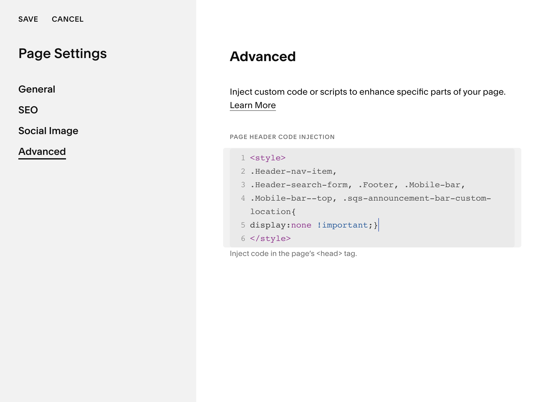
TIP: IF YOU WOULD LIKE TO ONLY HIDE THE HEADER AND FOOTER ON ONE SINGLE PAGE, ADD THE FOLLOWING CODE IN THE SETTINGS OF THAT PAGE (INDEX PAGE FOR 7.0) AND PLACE UNDER ADVANCED.
<style>.Header-nav-item,.Header-search-form, .Footer, .Mobile-bar,.Mobile-bar--top, .sqs-announcement-bar-custom-location{display:none !important;}</style>5) Lastly, if you want to add your own custom footer via your Page editor, feel free to do so! Adding in content such as your social feed, or contact details is always a great idea.
Now that you’ve created a stellar landing page, all that’s left to do is test it out! Ensure the form is linked correctly and test it out as if you were a website visitor.
Now it’s time to share that page you’ve worked hard to build, share it with your community and on social media, sit back and watch all your leads fly in!
Looking to make a strong first impression with your website?
Our Squarespace website templates may be the right fit for you! Our DIY option allows you to play and plug your content and get you launched pronto!


