Maximizing your Website Real Estate “Above the Fold”
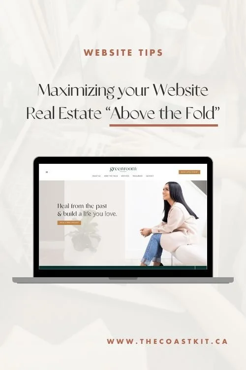
When it comes to strong web design, the most impactful section of a website is the section that appears within seconds of a potential client entering your website. Many refer to this content section as the section “above the fold”, meaning, before taking action to scroll further, this is essentially what clients will see before moving on down through your website!
This is one of the MOST IMPORTANT sections on your website, as first impressions on websites are crucial to keep visitors interested and wanting to learn more. They often say that the average attention span of a human is 8 seconds, so as a business owner, you really do only have a short amount of time to capture attention to entice visitors to take further action.
In this post below, we’re going to share our top six items you should consider having on your website above the fold to keep website visitors interested and engaged instead of bouncing off right away!
LET’S DIVE RIGHT IN!
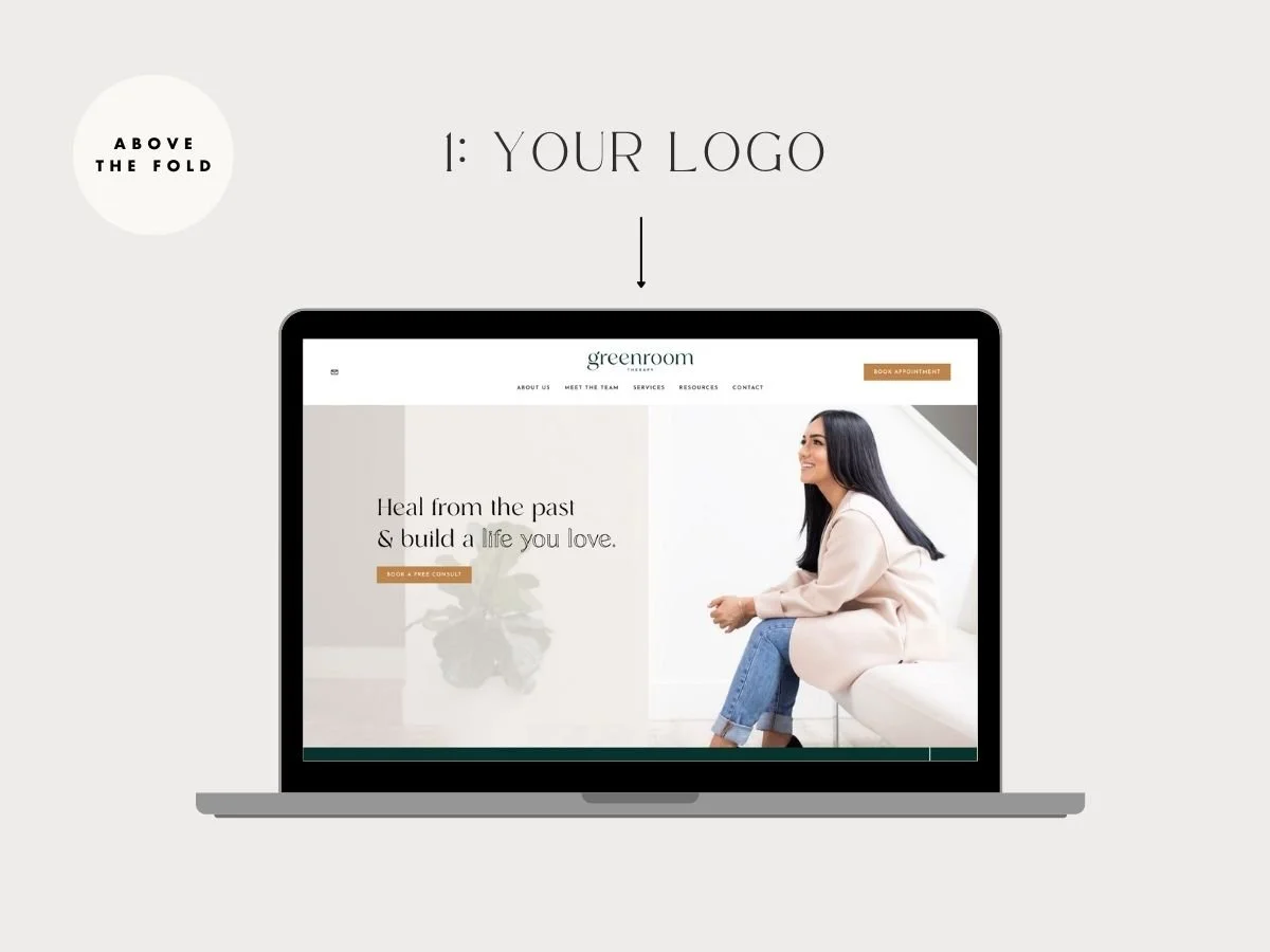
Visitors should immediately have a sense of who you are and what you do when first entering your website. Your logo, being the visual identifier of your business, is the very first element that should be displayed upon entering a website.
PRO TIP: You’ll want to ensure you upload your logo file as a .PNG, that way it has a transparent background with no white box around it! You’ll also want to think about how this logo would look on a mobile device too (ie. is it too large in height?) We often love horizontal sized logos the most to maximize the use of real estate above the fold!
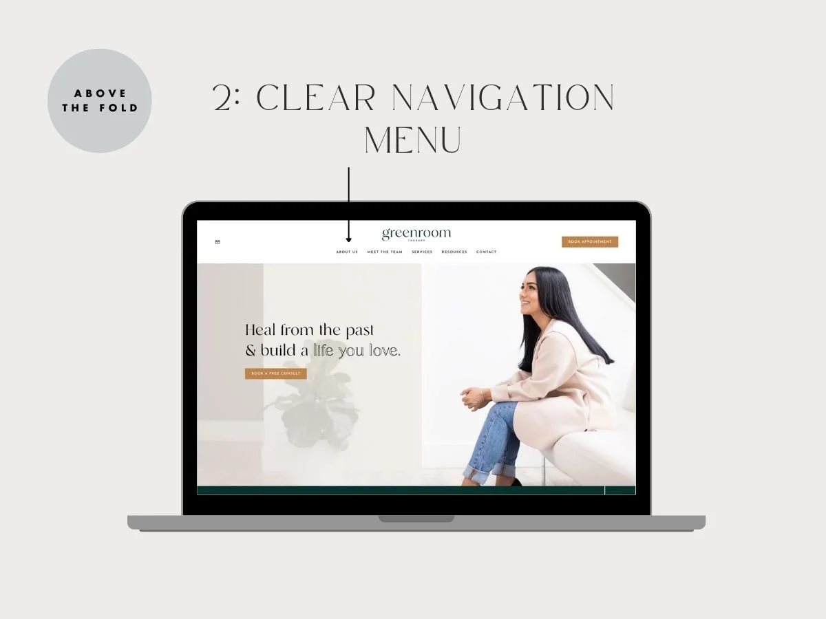
Strong navigation is another one of the most important features to have on your website above the fold. Well thought out navigation menu items help website visitors quickly and easily find what they are looking for and this most definitely needs to be placed above the fold of your website so potential clients can easily navigate where they’d like to go.
PRO TIP: We always suggest not overwhelming website visitors with a tonne of website navigation menu items. Keep it simple and organized. Our rule of thumb is about 5-6 navigation menu items, all of which speak to the needs of what clients are after.
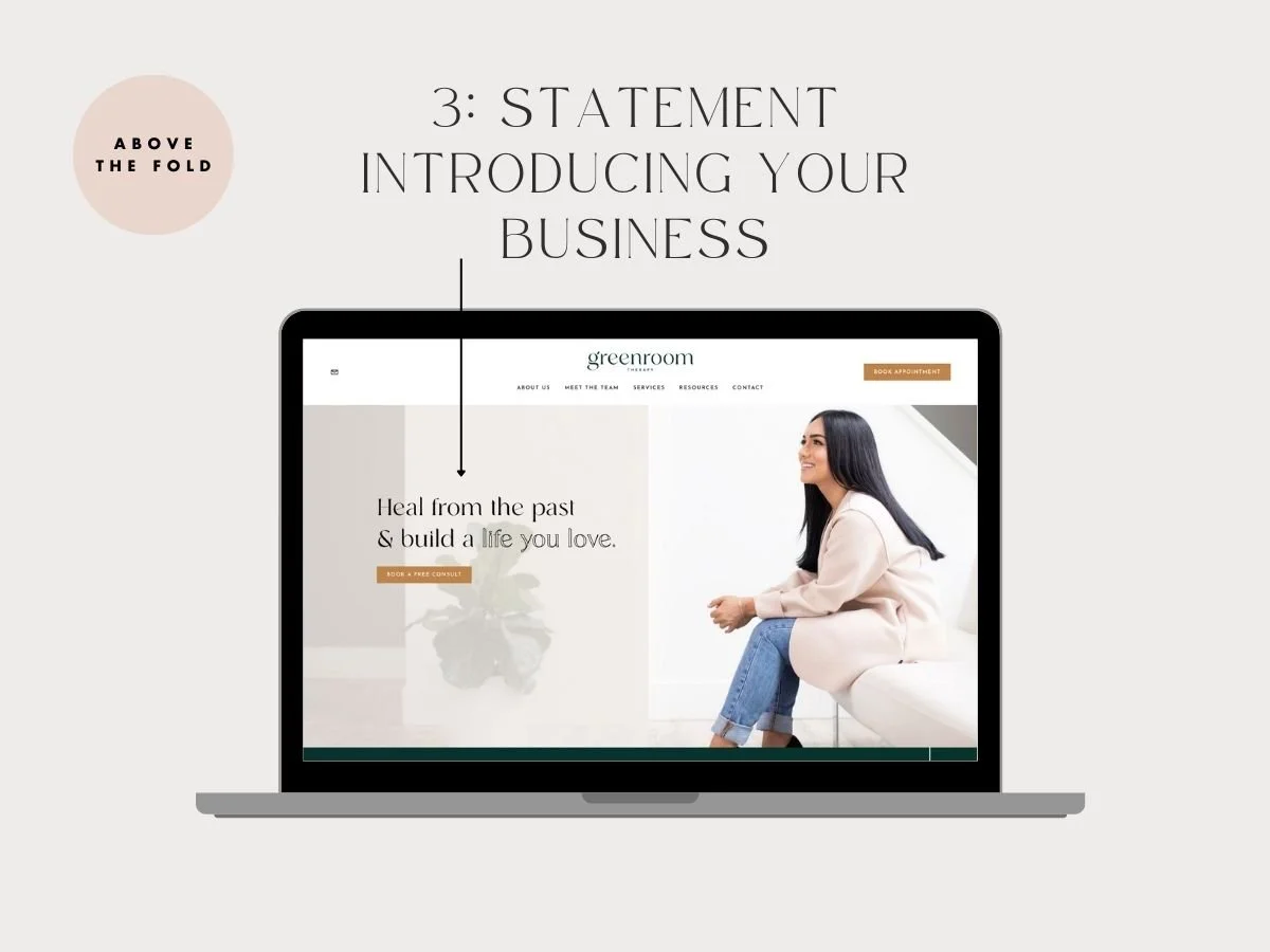
The intro statement on your website is another one of the most important elements to have above the fold on your website. Simply put, this is your mission statement defining who you are and what you stand for and why people should care about you and your business! Within seconds, potential clients need to know what you do, and if they have to scroll on further to figure this out, this may ultimately impact your bounce rate, leaving clients super confused!
PRO TIP: We suggest keeping this intro statement short and sweet. Big picture here! You do not need to get into too much detail or break out into a paragraph of text. One sentence only will do the trick! (Especially considering how this will look on mobile devices too! 😉)
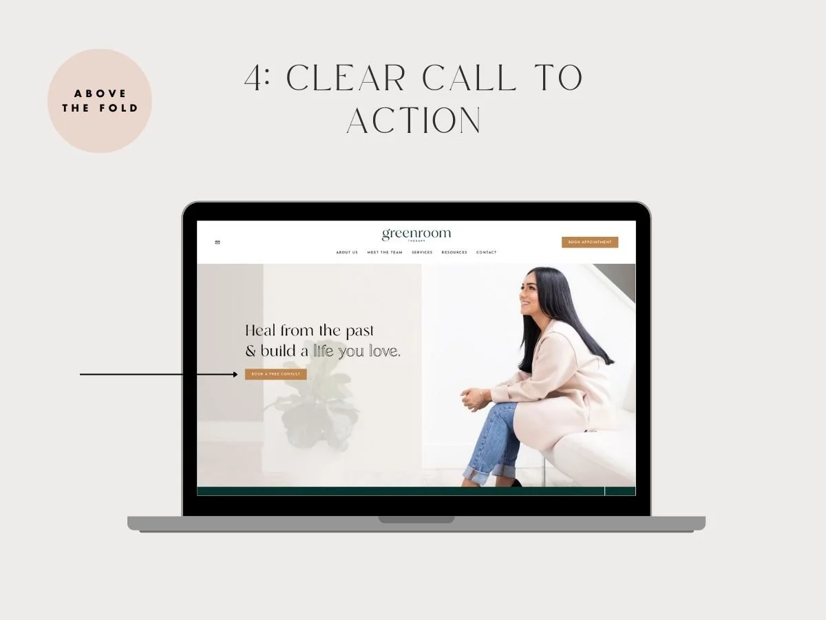
A clear Call To Action above the fold is always a great way to guide your visitors where you want them to go. A call to action should be simple and actionable. It should include a verb (action word) that clearly directs the visitor on what they should do next such as REGISTER NOW / LEARN MORE / BOOK A FREE CONSULT (and so on!).
Your website should ultimately have one primary ACTION you want your clients to take. Whether that’s filling out your Contact form for project inquiries, Booking an Appointment with you or buying from your online store, having a strong CTA in the section above the fold can help direct clients where you’d like them to go instantly as it’s a central location on your website that clients don’t need to go looking for.
PRO TIP: Try to use contrasting colours for your call to actions so they STAND OUT! If you’ve worked with a Brand Designer, they’ve likely set up a powerful brand colour palette for you adding a colour that pops specifically to use for CTA’s on your website. There’s a whole study behind colour psychology and the feelings that colours evoke in branding, so this is very important to pay attention to!
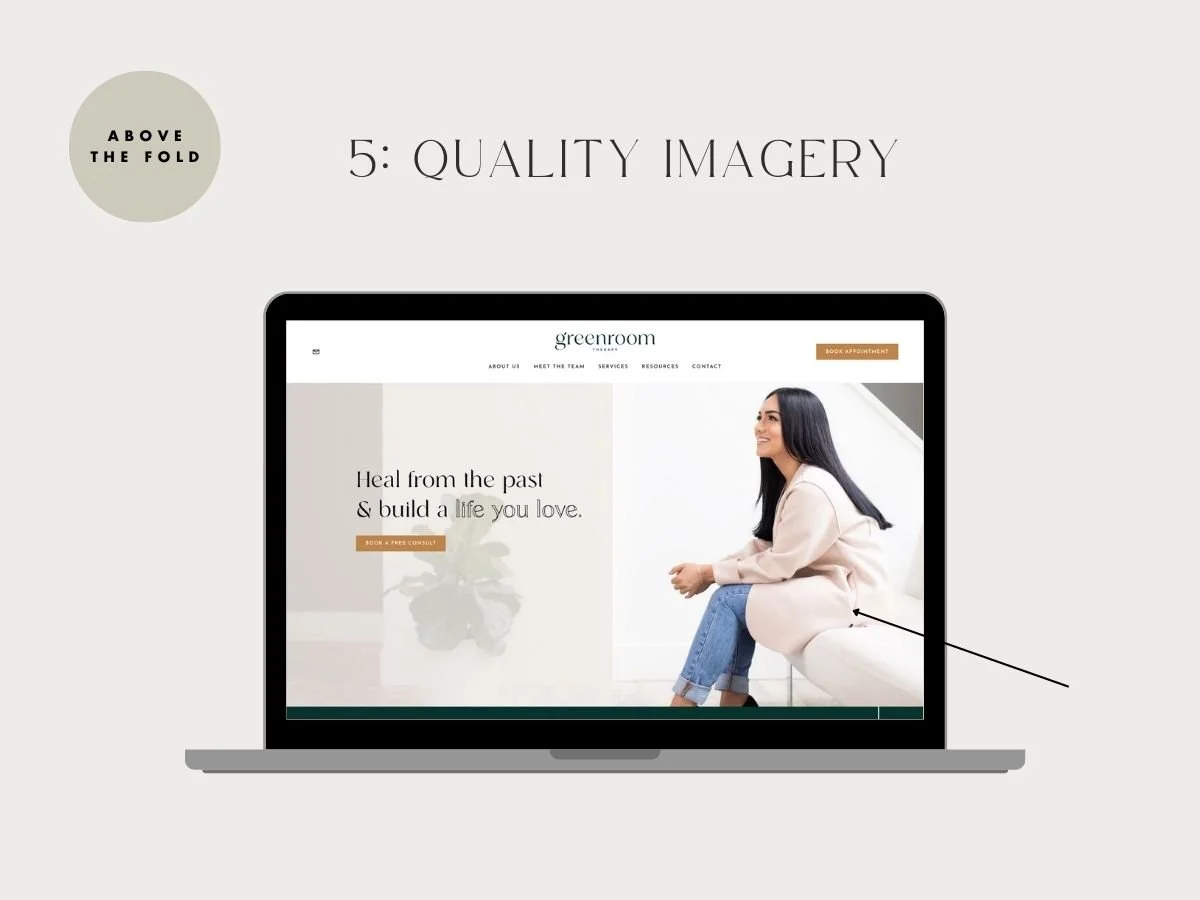
Quality imagery for any website is SO very important. In fact, the first thing we ask any client looking to hire our team for a web build is if they have strong brand photos! We could go on and on about this one, but simply put, having strong brand imagery that matches the overall tone, voice and aesthetic of your brand can be a GAME CHANGER for your website.
We highly suggest (if the budget allows) to consider investing into a brand photoshoot with a professional photographer that can create web-sized imagery. If images aren’t great quality, when placed on your website at a larger scale, they will appear pixelated and blurry, which will instantly say A LOT about your business & drive clients away. Alternatively, there are many ways to purchase quality photos online, but we’d suggest to approach this strategically, gearing away from the typical overused stock images!
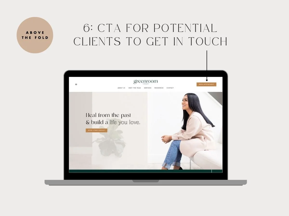
Another Call To Action opportunity above the fold is to add a CTA within your top navigation bar. Of course, this would only appear on Desktop versions of your website (whereas for mobile devices it would typically appear in the dropdown menu), but it’s another great action triggering touchpoint that will show up consistently on every page of your website! Win Win!
Overall, as you can see there are SO many important elements just within one section on your website that need to be considered to make an impact. By strategically implementing the above suggestions above the fold, you’ll further impact your conversion rate.
Looking to make a strong first impression with your website?
Our Squarespace website templates may be the right fit for you! Our DIY option allows you to play and plug your content and get you launched pronto!

