How to Add a FAQ Dropdown Accordion to your Squarespace Website
As your web design BFF’s, we understand that certain sections of your website may have a lot of information you need to fit in. As we love to keep content simple and concise, we highly recommend using a dropdown accordion for these instances (a great example is your frequently asked questions).
And in case we couldn’t rave about Squarespace any more, they’ve recently made it even easier with their ACCORDION block, making it intuitive to add these in throughout your website (and, it’s on Squarespace 7.0 and 7.1!). Gone are the days with adding in custom code to achieve this look.
HERE’S AN EXAMPLE OF WHAT WE MEAN!
-
And a place to put your answer.
-
And a place to put your answer.
-
And a place to put your answer.
We’re going to breakdown how simple it is to create these dropdown accordions for you and a few unique instances you can use them for as well!
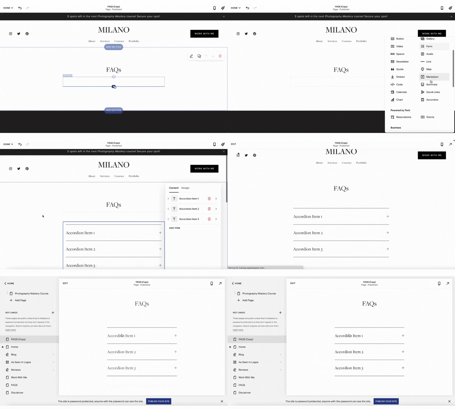
STEP ONE. ADD BLOCK ELEMENT.
You’ll simply want to add in a new block element and choose the ACCORDION option. This is available in both Squarespace 7.0 and 7.1, and you can use it on your pages, blog posts, etc. A great example of using this is your FAQ’s page where you can add multiple questions and allow users to expand for more info!
STEP TWO. ADD CONTENT.
You’ll then want to go through and add all of your content in, which Squarespace has broken down by TITLE and DESCRIPTION (or QUESTION and ANSWER if you are using it for your FAQ’S). From there, you can easily add more or duplicate.
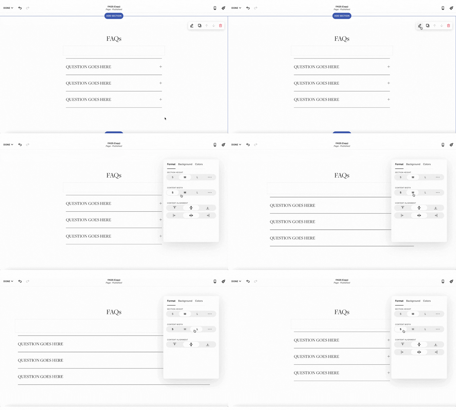
STEP THREE. DETERMINE WIDTH OF SECTION.
OPTION A.
Before diving into the styling, let’s determine the width of this block. If you are using Squarespace 7.1 and this block is the only content in a section, feel free to play around with the CONTENT WIDTH to achieve your desired look.
OPTION B.
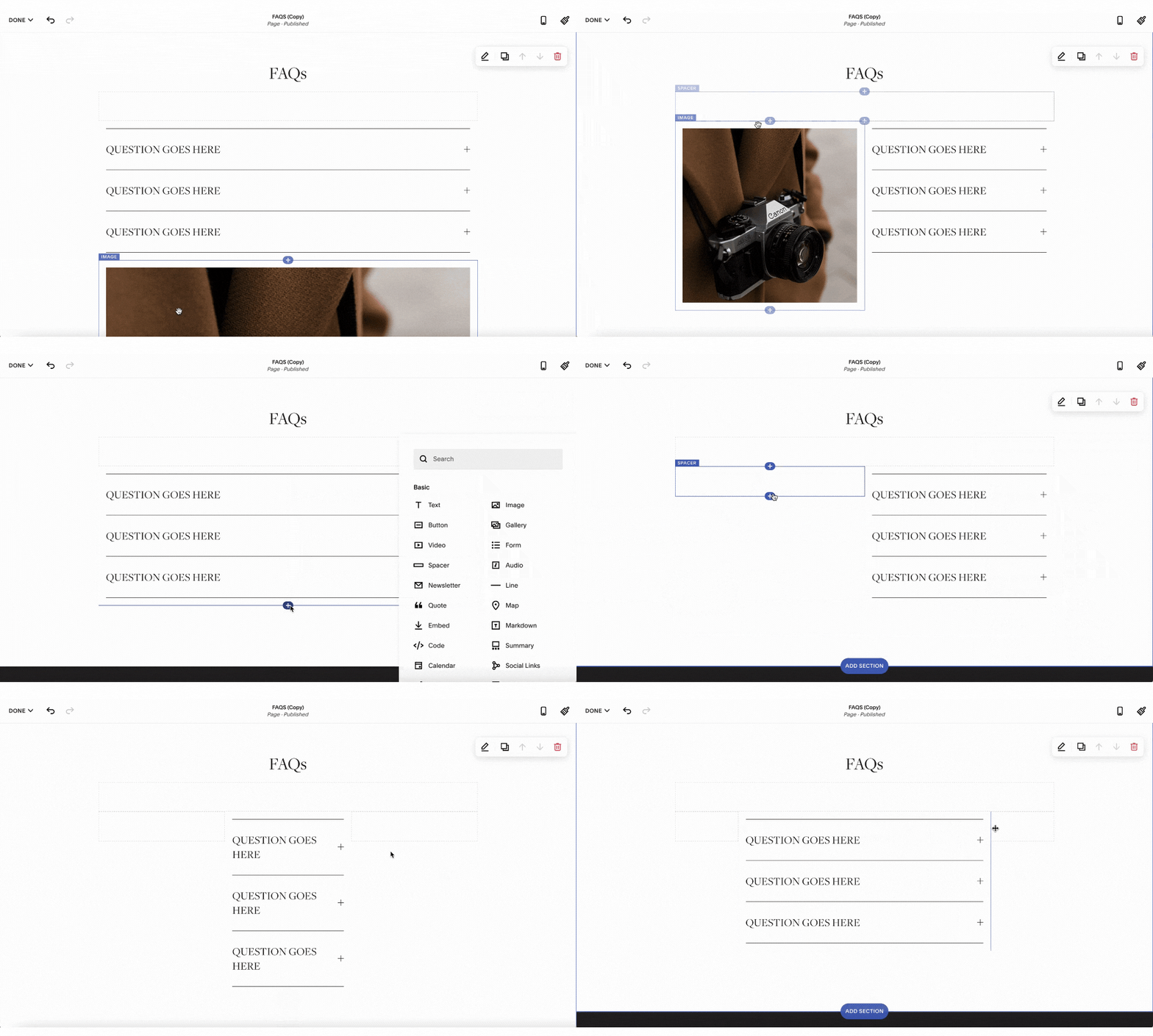
If you are using Squarespace 7.0 or the accordion is with other blocks in that section, we recommend using the spacer blocks to make an appropriate width. You can also move the blocks around side by side (like next to an image!)
TIP: Overall, we recommend making your accordions not too wide, this allows the content to be easier to read!
Step FOUR. STYLIZE + DESIGN.
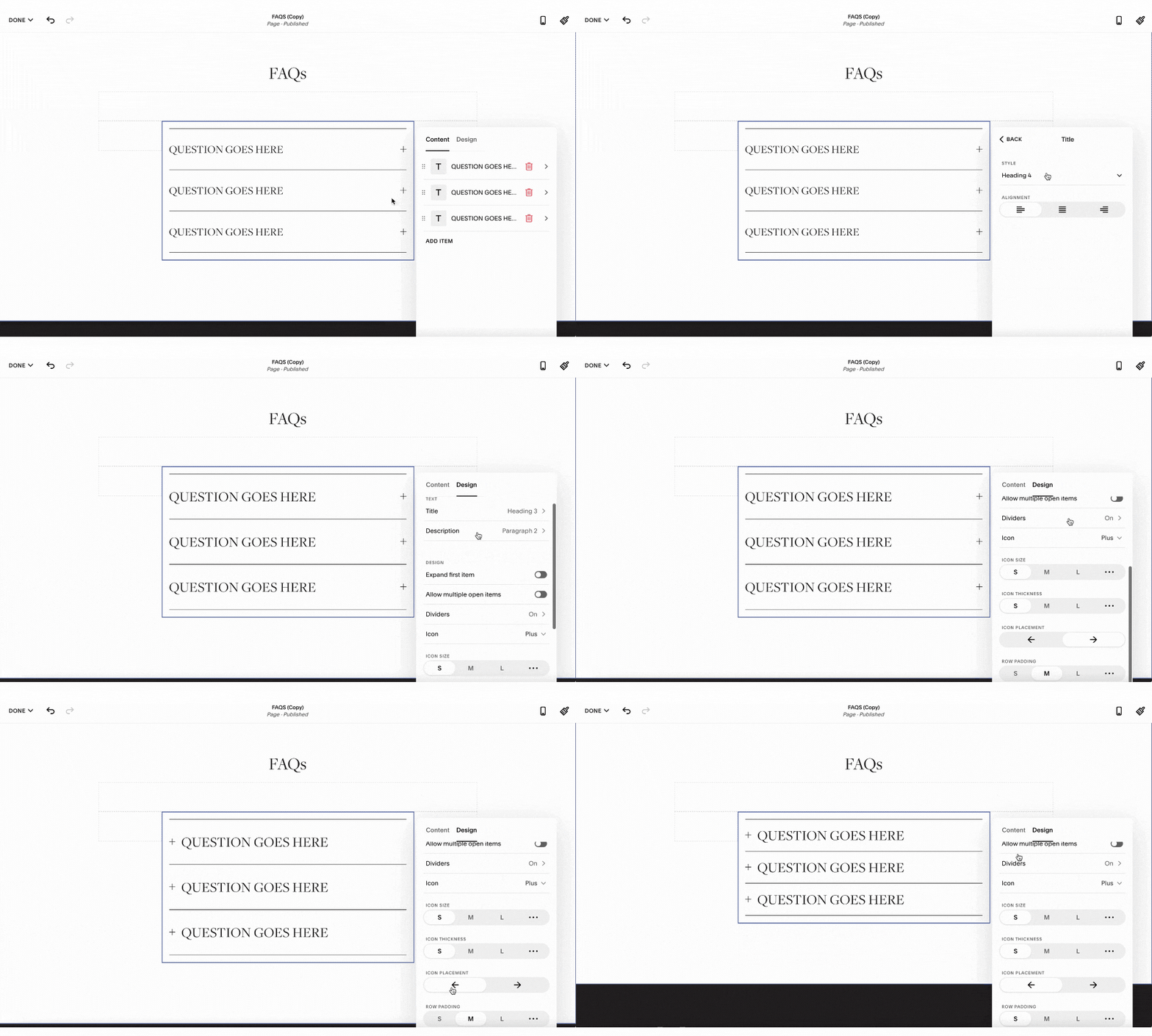
Squarespace makes it easy to achieve a certain look under their DESIGN tab.
Here’s a few things you can update directly:
• style of the title and description
• options to expand items
• ability to hide the line dividers
• choose an icon style, size, thickness, and placement
• adjust row padding
And just make sure to SAVE your page.
Step FIVE. FUN WAYS TO ADD TO YOUR WEBSITE!
We highly recommend using this option for your FAQ’s page, but we have a few more unique ways the accordion block can be used!
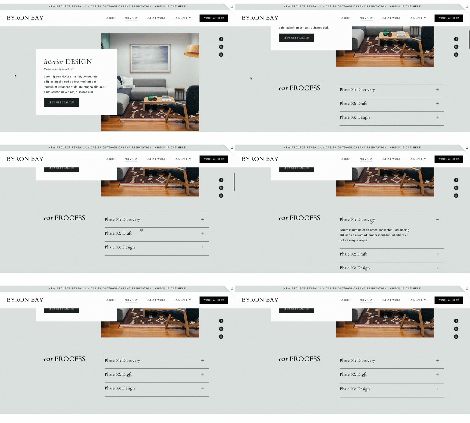
OPTION A. BREAK DOWN YOUR PROCESS.
It’s a great way to reveal your process, steps, or phases as it allows a client to absorb this information in a straight forward way. Here’s a great example we used for an interior designer as we are able to use a different block for each service!
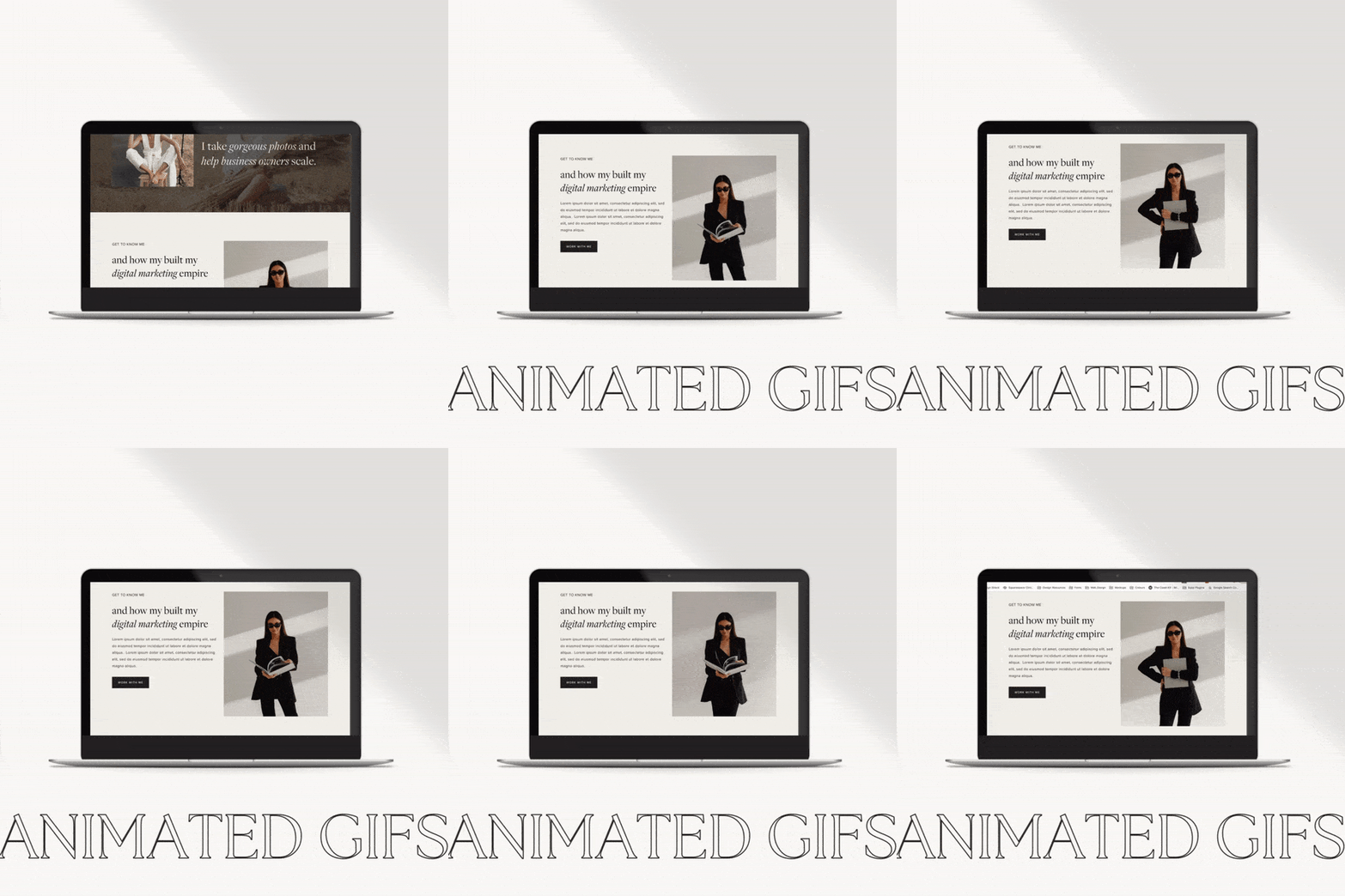
OPTION B. ADD PERSONALITY TO YOUR ABOUT PAGE.
We’re big fans of adding personality throughout your website, and an accordion works wonders in giving your users a glimpse to who you are and your favourite things. Here’s an example of using this for an about page and different prompts for team members.
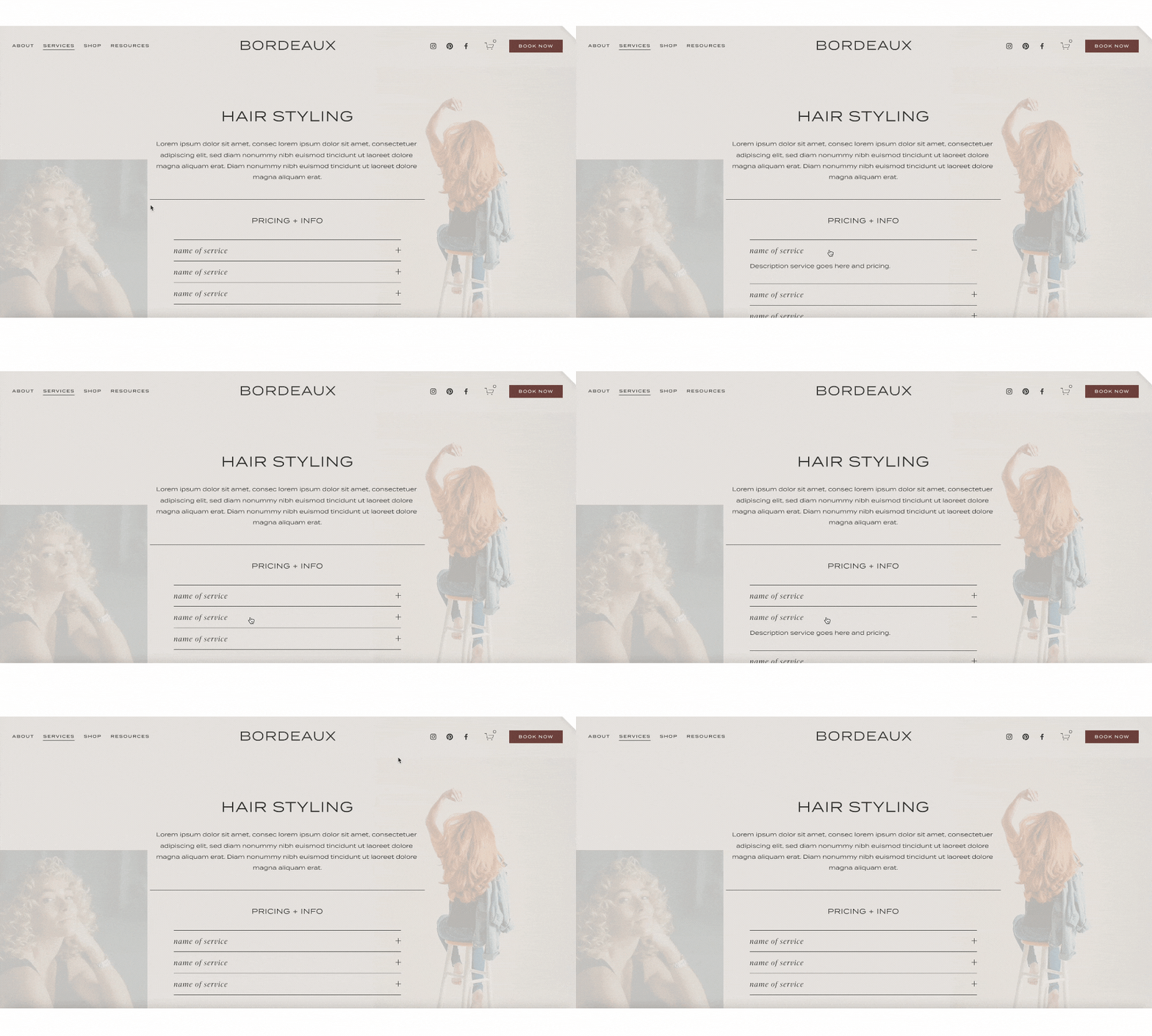
OPTION C. CLARIFY YOUR SERVICES AND PRICING.
Using the accordion block can really help declutter your information, especially if you are a service based industry. For example, we’ve used this option to break down each service and ability to add pricing.
Step SIX. ADDITIONAL STYLING.
Overall, the design options Squarespace automatically has is incredible, but in case you’re looking to add a bit of extra oomph, here’s a few code snippets to customize your accordion even more!
Feel free to update the css options such as font size, color, and letter spacing for each option or delete attributes you don’t need!
STYLIZE TITLE FONT
-
Description text goes here
-
Description text goes here
-
Description text goes here
/* stylize title font */ .accordion-item__title
{
font-size: 13px;
color: #b0694e;
letter-spacing: 3px;
}STYLIZE DESCRIPTION FONT
-
Description text goes here
-
Description text goes here
-
Description text goes here
/* stylize description font */ .accordion-item__description
{
font-size: 13px;
color: #b0694e;
letter-spacing: 3px;
}STYLIZE ACTIVE TITLE + HOVER
-
Description text goes here
-
Description text goes here
-
Description text goes here
/* stylize active title and hover font*/

 .accordion-item__title:hover, .accordion-item[data-is-open="true"] .accordion-item__title
{
font-size: 13px;
color: #b0694e;
letter-spacing: 3px;
}
Overall, we absolutely love this new addition to Squarespace and the fun opportunities to bring it into websites!
Looking to make a strong first impression with your website?
Our Squarespace website templates may be the right fit for you! Our DIY option allows you to play and plug your content and get you launched pronto!


