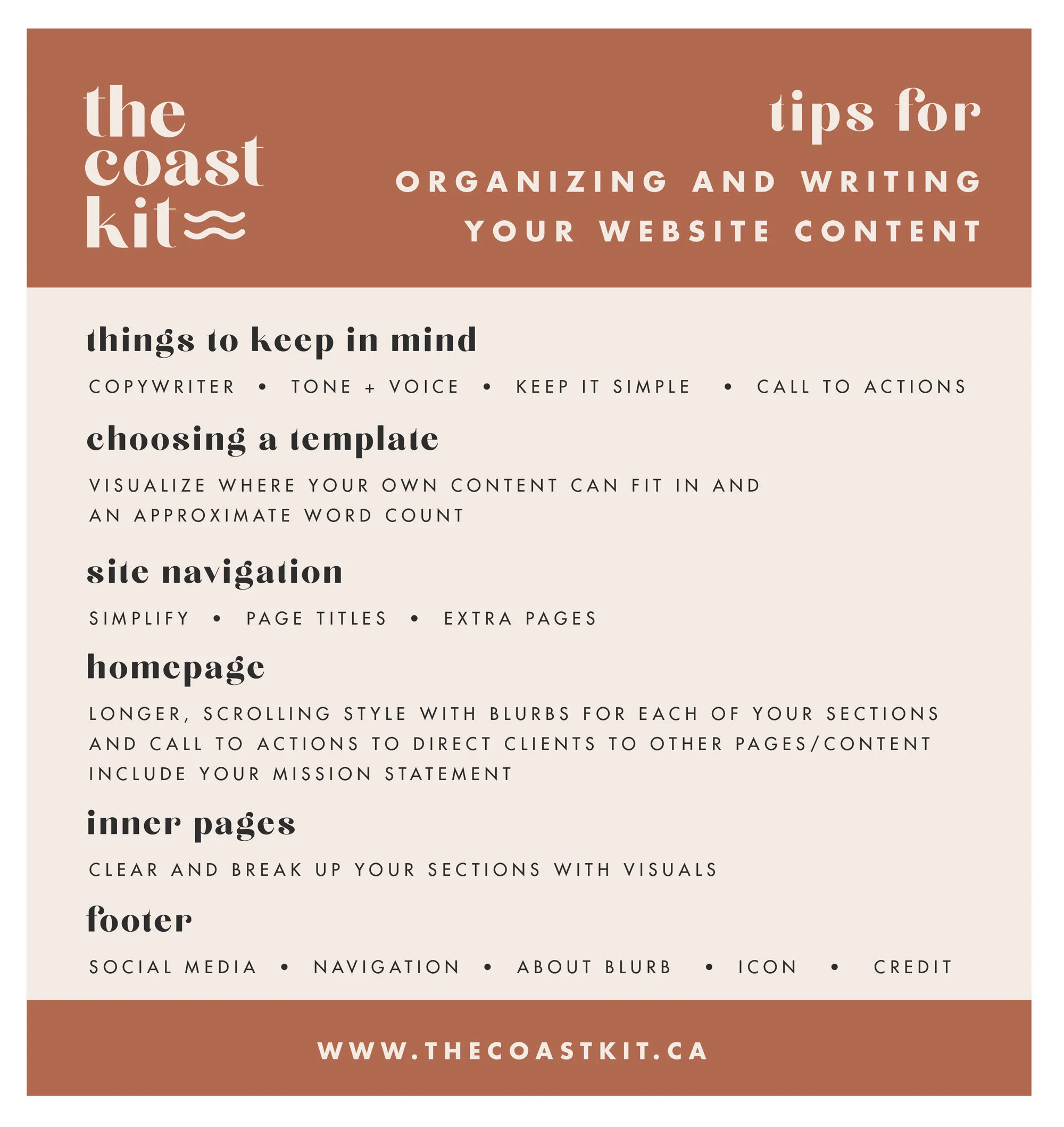
Tips for organizing and writing your website content
Struggling with what “exactly” your website should say? We’ve got some tips for organizing THAT website content OF YOURS.
Whether you’ve gone with a website designer or decided to DIY it, as a business owner you have to take some time to decide exactly WHAT your website is going to say.
Sure, it can look darn good (that’s where we come in), but if your content isn’t clear and totally misses the point, you’ll leave your potential clients confused (not a great start).
We’re offering a few tips to jump start this process from your site navigation all the way down to the footer (and all the things in between).
things to keep in mind
one. copywriter
If you’re struggling with what to say, want a second set of eyes, or just want one less thing to worry about, we highly recommend hiring a copywriter. They can jump in at any point, help you from scratch or give your “already-written” content that extra “oomph”. They’ll be able to keep your content concise, all while keeping your unique tone and voice.
two. tone + voice
This is a large part of your brand; how you want to come across to your potential clients. You’ve likely decided who your target audience is, so keep that in mind with every part of your website. Adding in snippets of personality (everyone loves a good HEY!) and using specific verbiage (we like to say BIZ ourselves) can help attract that ideal client of yours. What problems are you solving for your ideal client? Why do they need you and your business? Try to speak to your ideal clients emotions.
three. keep it simple
Your website visitors are likely going to skim your content, so you want to make sure they get the overall message QUICKLY! To do so, keep your content short and simple and this will also prevent your website from looking too cluttered.
four. call to actions
We’re referring to the buttons found throughout the website, as this directs your visitor to “take action”, whether it’s to go to a different page, read more, or contact you. Keep the wording on these relevant and obvious, like BOOK A CONSULTATION.
choosing a template
We highly recommend choosing a template kit that is a great fit for you and your business and we’ve developed various kits depending on the industry. With that, it will help you visualize where your own content can fit in and an approximate word count (trust us, less is better).
With each template, we’ve also set up various pages, each having a few sections. This allows the content to be broken up and easier to grasp.
site navigation
While your pages may not exactly match up, using a template as inspiration is a good idea for a few reasons.
one. simplify
You’ll notice most of our template kits have 5-6 pages, and we wouldn’t recommend any more. You may want some “sub menus” for different services, but minimizing the amount of content will improve the client’s experience on your website (and they’ll also figure out what the heck you do a-whole-lot quicker).
TIP: If there’s something you want to focus on, but don’t want to add any more clutter, we’d suggest writing a blog post about it.
two. page titles
You’ll notice almost ALL of our templates (and heck, websites) have an ABOUT and CONTACT page, and those are basically a requirement. Why? Your clients want to know who YOU are, and then they WANT to work with you, so let’s make that as straight forward as possible. Having a HOME in your navigation isn’t *as* required, as most logos will link back to your homepage. And from there, it’s up to you to decide what’s best, are you wanting to showcase what you can do (SERVICES), display your portfolio (GALLERY), frequently create new content (BLOG), or sell items online (SHOP).
TIP: Keep in mind each of these pages can have different sections, so you may be able to combine pages.
three. extra pages
If there are some pages that are still necessary, but don’t need as much focus (such as a FAQ), add those links into the footer instead.
TIP: You can create secondary navigations in Squarespace, and this may be a good opportunity to add your social media.
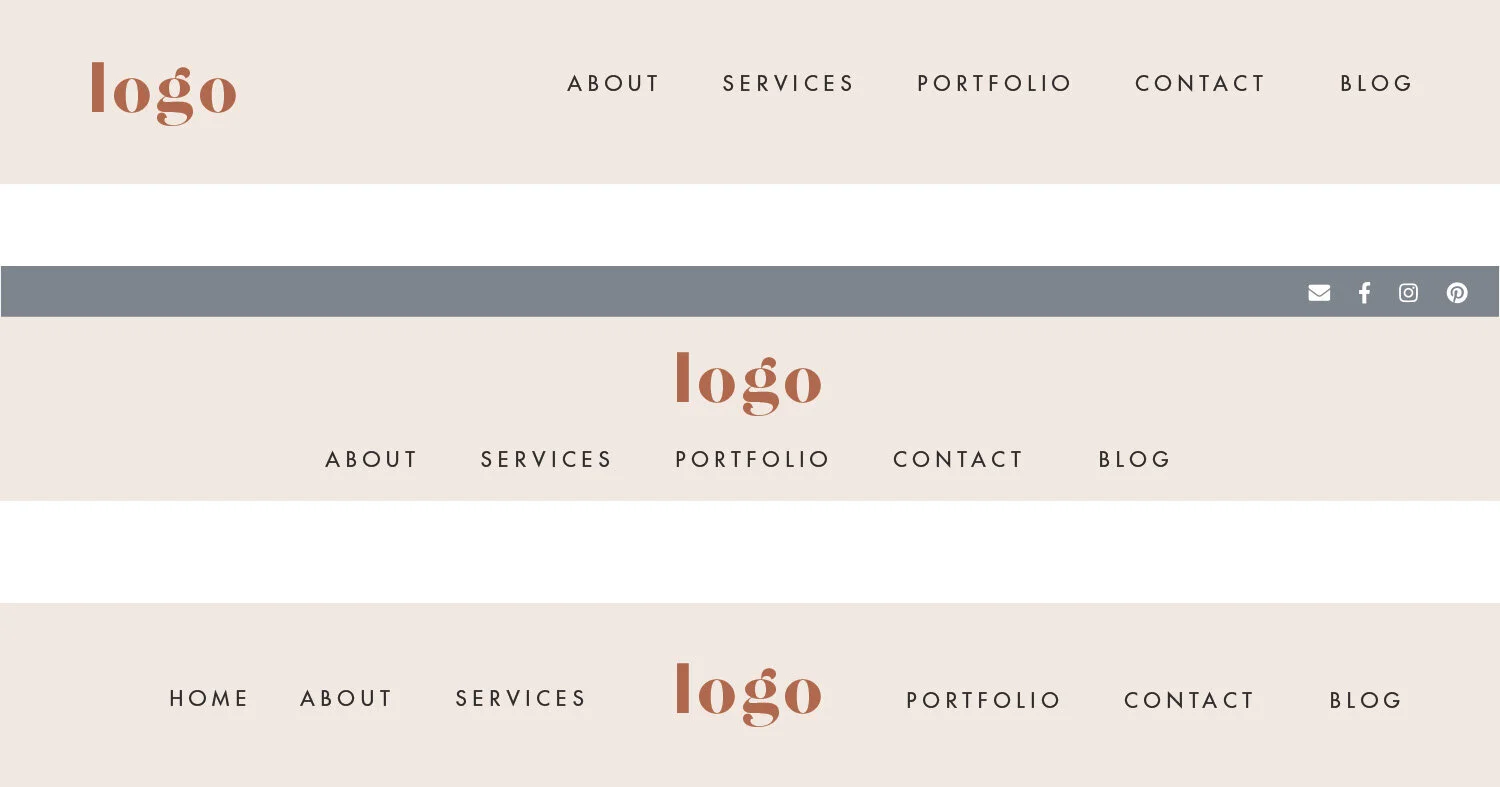
Squarespace offers a few different layouts for your navigation.
homepage
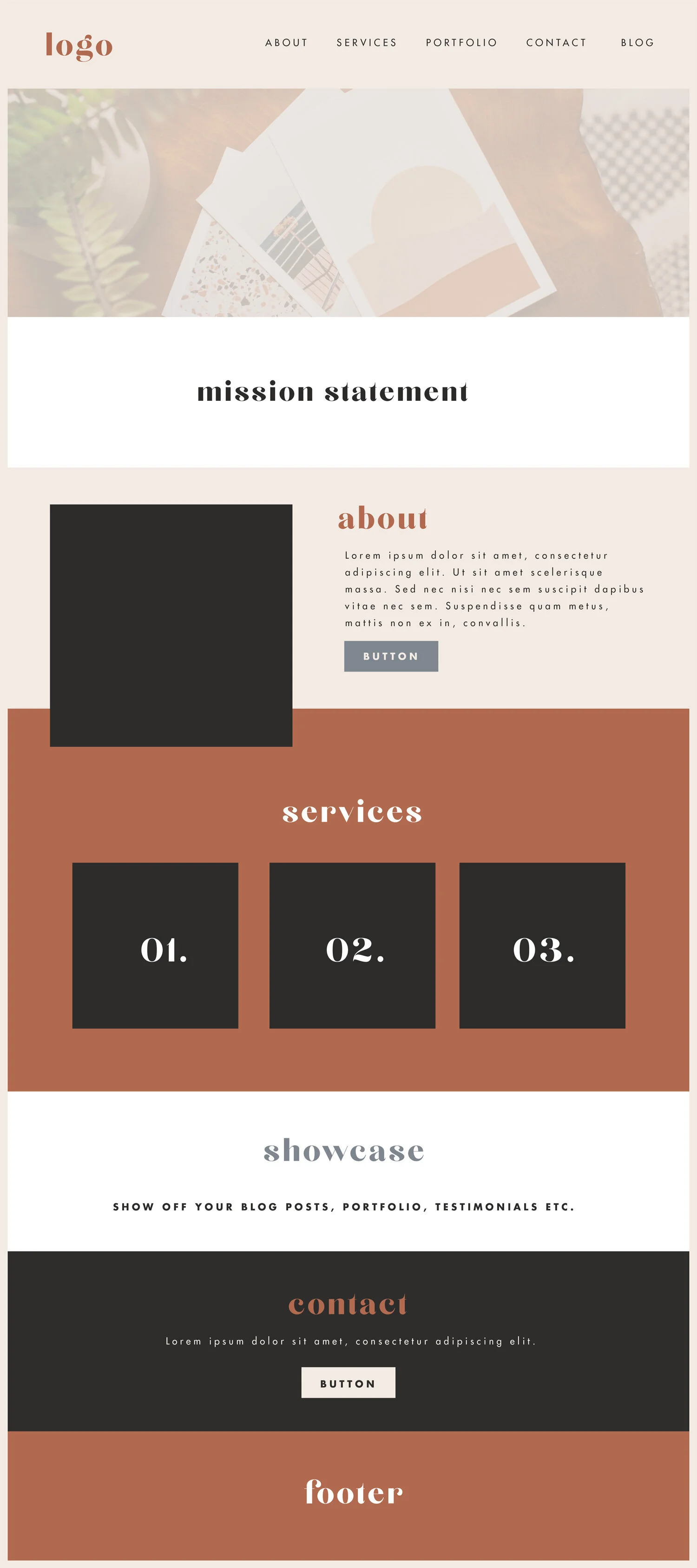
You’ll notice that many of our template kits have a longer, scrolling homepage design and we believe this is the best way to get your message across (trust us). Broken up with some images and different colored banners, this allows your website visitor to flow through all of the information in a quick and easy manner.
We recommend you having a MISSION STATEMENT towards the top, which is a quick blurb on who you are and what you offer.
TIP: If you’re location based, add that in too.
We also suggest “compressing” your website pages into little blurbs to be found on the homepage.
Our favourite examples? Your ABOUT section can simply have a paragraph with a button (call to action) that leads to the ABOUT page with more of your bio/information. Before your visitor gets there, they’ve already learned a thing or two. Your SERVICES section can simply have just the service title listed on the homepage as a grid, and if your client would like more info, they can click through.
There may be a few other sections to add, such as adding in blog excerpts (‘excerpts’ being the key word here, remember, simpler is better), a newsletter sign up, or even testimonials.
TIP: Keep those testimonials short and sweet as well.
You’ll want a CALL TO ACTION directed to your CONTACT page as well, just that extra nudge your potential client might need.
This will then allow your homepage design to flow right into your footer (which is found at the bottom of all of your pages and blog posts)
inner pages
Each of your inner pages will be unique to you, but feel free to use our template kits as inspiration for your content. Our biggest takeaways after years of designing websites is to keep it clear and break up your sections with visuals (images, banners) and use columns instead of long sentences. And of course, don’t forget those CALL TO ACTIONS and keeping your IDEAL CLIENT in mind.
footer
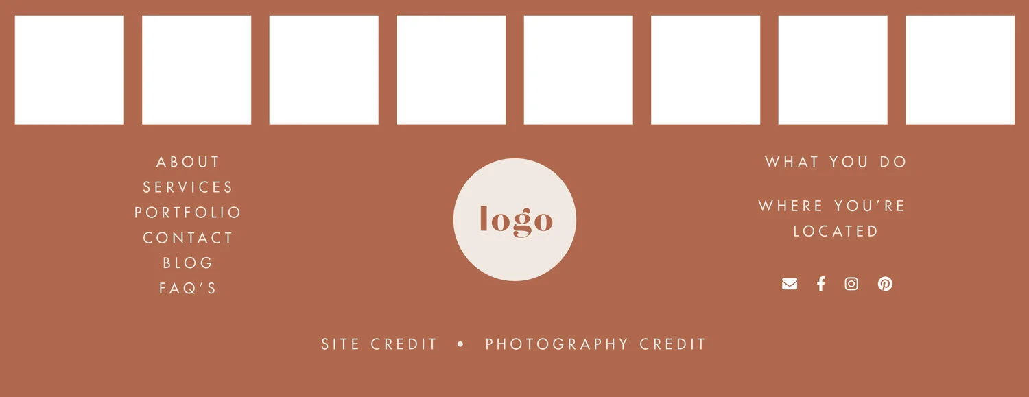
We like to have a lot of fun with our footers, and this is a great opportunity to leave your visitors excited for more. This is an ideal place to link up to your social media (whether it’s your instagram feed, social icons, or both).
We recommend adding in your site navigation again below (and as mentioned above, if you have some extra pages). You’ll likely want to add in a blurb about what you do and location (if it’s important) as this helps with search engine optimization. To keep brand consistency, we love to add a little branding element (maybe your logo or an icon).
Lastly, you’ll want to add some external links to resources you’ve used (template kits, photography, etc.) because everyone appreciates a little credit love.
And our last “must-do” tip, proofread, proofread again, and then have someone else read through. The beauty of the web is, it’s an easy change, but it’s best to look professional from your potential client’s first interaction with you (your website!).
Looking to make a strong first impression with your website?
Our Squarespace website templates may be the right fit for you! Our DIY option allows you to play and plug your content and get you launched pronto!


