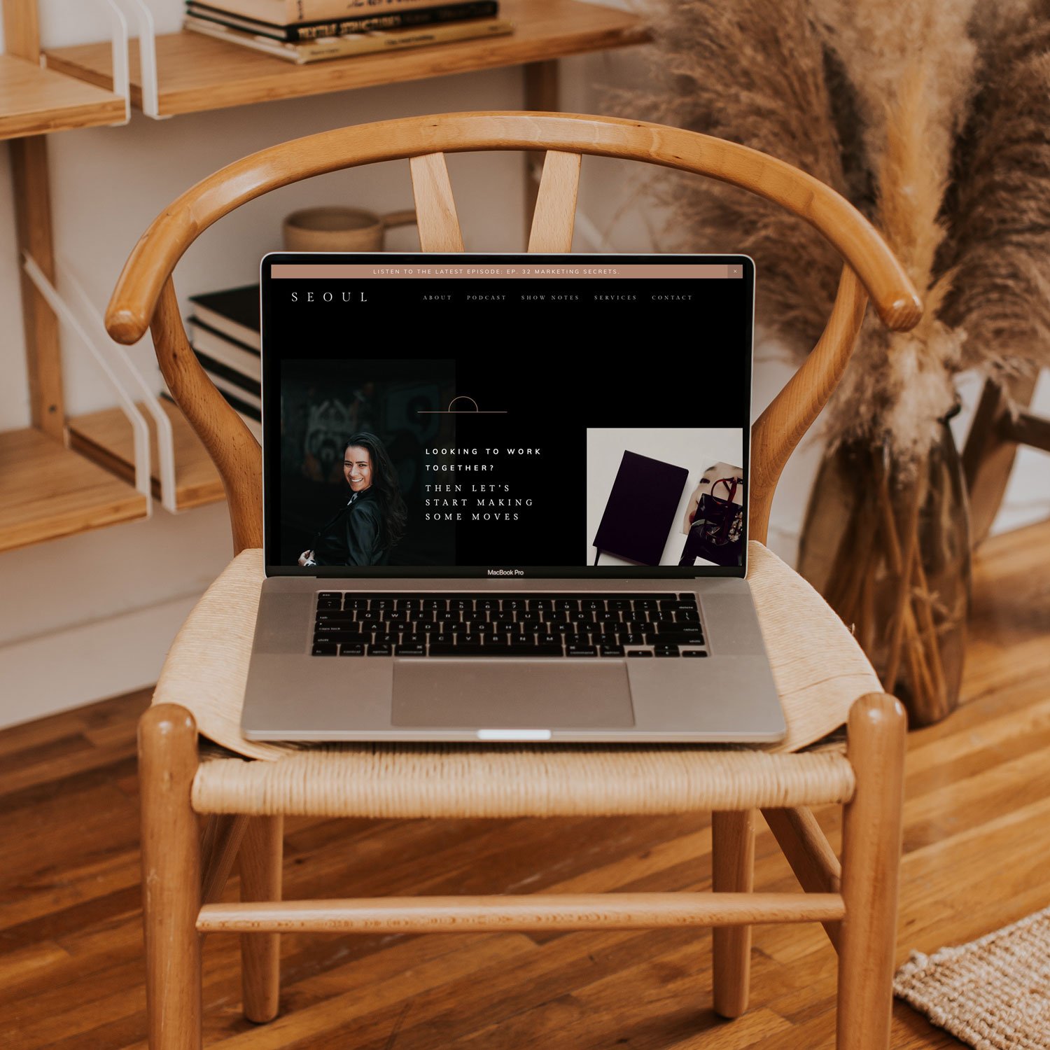
5 Ways to Take Your Squarespace Site To The Next Level
We’re big fans of the Squarespace website platform for so many different reasons.
With years of experience in building sites on Squarespace, we’ve mastered all the ins-and-outs of how you can take your website to the next level, and we just gotta share them with you!
Whether you’re new to Squarespace, have an existing site using one of our website templates or perhaps we’ve built you a website using one of our premium packages – in this post below, we’ll be covering a few of our favourite tips to make your site a lot more dynamic, edgy and take it to the next level!
tip one: section layering
As graphic designers ourselves, layering content is sorta our thang (and we’re good at it), and we find that many website templates out there in the marketplace don’t quite capitalize on this and can tend to be a little cookie-cutter – sorta boring right?
That’s where layering comes into play and all of our templates available in our shop are quite multi-layered. A good way to look at each section of your website is to think of it like a layered cake. By placing graphics and images on multiple layers, you are really going to get a much more dynamic effect. Throw in the parallax scrolling feature (currently only available in Squarespace 7.0) and voila – your site will be flowing beautifully!
tip two: animate err’thang
Squarespace recently added in an animation feature to their platform and this has been a game changer. Adding in simple animations for images or image blocks will really help take your website to the next level.
Adding in motion into your website helps create a cohesive flow, enhancing the overall experience for visitors. Whether you add in a slide up animation, or a fade in animation, each one gives off such a different feeling to really bring your website to the next level.
tip three: transform static images into dynamic images
There are so many ways you can transform an image on Squarespace, and rather than just inserting an image into an image box and calling it a day, why not take it to the next level?!
One way to do this, as an example, is with Banner images or solo images. Instead of having a static image, why not have it transition into multiple images using the IMAGE GALLERY block? Or take advantage of Squarespace’s IMAGE DESIGN options, using Image Cards, Image Overlaps or Image Collages to name a few!
tip four: make your pop-ups pretty
I’d say we’re all pretty used to pop-ups on websites now-a-days, and Squarespace offers so many unique ways to really take your pop-ups to the next level. One cool pop option that we don’t see used as much is a full-page popup. Jump into Marketing > Promotional Pop-Up and select the full-page option. Style it according to your business and viola, you have a pop-up page that’s guaranteed to capture the attention you are looking for that you have full flexibility to style too!
tip five: using multiple image blocks to have more flexibility with fonts / colours
A sneaky thing we love to do on almost all our websites is to use different image blocks for text or image sections that need to have different fonts than our standard fonts used for H1, H2 & H3. As you may already know, Squarespace 7.0 only allows for 4 key fonts on your site. So you may run into an issue where you have a dark background with dark text that you simply can’t change without changing the font and colour for the entire site!
This is where image blocks come into play. If you insert the text using an image block instead (ie. Inline Block or a Poster Block, for example) you can play with the specific font JUST for that section and you don’t have to worry about the font changing on all other pages on your site 😉
overall, these are just a few of the many things you can do to take your squarespace site to the next level.
Should you have any questions regarding your site or how-to questions when customizing your website template, do not hesitate to reach out to our team of web design experts here! We’re here to help!
Looking to make a strong first impression with your website?
Our Squarespace website templates may be the right fit for you! Our DIY option allows you to play and plug your content and get you launched pronto!


